
When solar panel output is lower than expected, the cause is usually not a broken system. In most cases it turns out to be a winter expectation gap, a monitoring misread, or a design limit working exactly as intended. Genuine faults exist, but they sit at the bottom of a ladder worth climbing in order, because each rung is cheaper to check than the one below it. This guide walks that ladder the way I check my own system.
What should your system actually produce?
A rough UK benchmark is 1,000 kWh per year for every kilowatt of panels on a good south-facing roof, but location moves that number by hundreds of kilowatt hours. Running the EU’s PVGIS tool for a 35-degree south roof gives about 1,159 kWh/kWp on the Brighton coast, 1,028 in London, and 854 in Glasgow, all for a 35 degree south roof with typical system losses. An east or west roof gives roughly 15 to 20 percent less than south, according to the Energy Saving Trust.
So before judging your system, get its honest target: put your postcode, panel capacity, tilt and orientation into PVGIS and read off the annual and monthly figures. Divide your actual annual generation by your kWp and compare. As a rule of thumb rather than any official standard: within about 5 percent of the estimate is measurement noise, a shortfall of 20 percent or more is worth investigating, and between those two, watch it for a few weeks before spending money.
Is it just the time of year?
The winter expectation gap is the most common false alarm of all. A system in England or Wales generates roughly a quarter to a third as much in December as it does in June, and in Scotland the December fraction can drop below a fifth, and day to day the swing is wilder still, because a thick overcast sky leaves panels running on diffuse light alone.
If your concern started in autumn, check the monthly shape before anything else. I published the full month-by-month PVGIS figures in my solar output by month guide, and comparing your monitoring against that curve is the quickest check on this whole page. A system that tracked the curve last summer and tracks it this winter is not broken. It is just January.
Is the monitoring lying to you?
Before blaming the roof, make sure the numbers are real. Monitoring faults are common, and a system can generate perfectly well while its app reports nonsense or nothing.
The classic cases are worth checking one by one. A CT clamp fitted backwards or on the wrong cable makes import look like export, or shows a mysterious constant draw that never existed. A dead Wi-Fi dongle or failed comms board takes the app dark while the inverter carries on working, so read the inverter’s own display before concluding anything from a blank app. And a surprising number of “underperformance” complaints dissolve once kW and kWh are untangled: a 4 kW system peaking at 2.8 kW on a hazy day is normal, and the daily energy total is the number that matters. If the inverter display and the app disagree, trust the display and get the comms fixed at leisure.
Is the flat top on a sunny day normal?
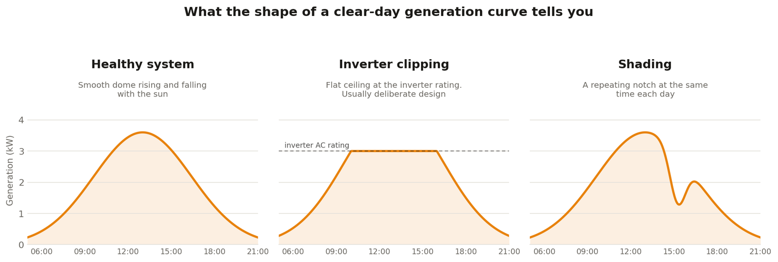
If your generation curve rises smoothly, hits a hard ceiling for the middle of the day, then falls smoothly, that is inverter clipping, and it is usually deliberate design rather than a fault.
UK installers routinely fit more panel capacity than the inverter’s AC rating. The MCS installation guidance describes inverters rated at 80 to 100 percent of array capacity as common practice, and manufacturers allow more headroom still. The logic is that panels almost never deliver their nameplate in UK conditions, so an undersized inverter trades a few flat-topped summer lunchtimes for better performance the rest of the year. I have written about the trade-off in my overpaneling guide. A flat top a handful of days a year is the design working. A flat top at a suspiciously low ceiling, or clipping from mid-morning in March, is worth querying against your inverter’s rated output.
Why does output sag in heatwaves and dips at odd times?
Two physical effects surprise owners every summer: panels lose power as they heat up, and small patches of shade do damage far beyond their size.
Modern silicon panels typically lose 0.3 to 0.4 percent of output for every degree the cells rise above their 25 degree test temperature, with the exact figure on the datasheet, and roof-mounted cells in July sun run far hotter than the air. A blazing 30 degree afternoon therefore peaks lower than a bright, cool May morning, which feels backwards until you know the mechanism. I cover it fully in do solar panels work in heat. Inverters join in too: many domestic units begin thermal derating once ambient passes the mid-40s, so an inverter boxed into an unventilated cupboard will shave its own output on exactly the days you expect the most.
Shade behaves worse than intuition suggests. A typical panel is wired internally as three sections, each protected by a bypass diode, so hard shade on one shaded corner can drop a third of that panel’s contribution at a stroke. On plain string systems the effect spreads further, because the string’s current follows its weakest panel. A chimney shadow crossing one panel at 3pm can put a visible notch in the whole system’s curve. If shade is your diagnosis, the mitigation options are covered in my power optimisers guide.
Is your grid voltage too high?
UK supply voltage is allowed to sit between 216.2 V and 253 V, and on sunny afternoons in solar-dense streets it drifts toward the top of that band. Inverters respond by derating or disconnecting, and the symptom looks exactly like a failing system.
The statutory band comes from the Electricity Safety, Quality and Continuity Regulations. GB-configured inverters do not trip the moment the supply touches 253 V; the G99 interface settings allow a stage-one disconnection at around 262 V held for a second, and Northern Ireland runs its own, different interface settings. But many inverters reduce power as voltage climbs, and repeated over-voltage errors on clear afternoons are a strong clue. My Solis OV-G-V01 article covers the pattern in detail. The statutory line matters here: 252 V is legal, and sustained voltage above 253 V is not. If your inverter logs the supply outside the permitted band, that is a complaint to your network operator rather than an equipment fault, and under the electricity standards of performance rules the distributor must respond within days or compensate you. Voltage hovering just under the limit with afternoon derating is a strong clue worth reporting too, but the statutory trigger is the band being breached.
Are you export limited without knowing it?
Some systems are capped on purpose and the owner has forgotten, or was never clearly told. A standard G98 connection caps the inverter itself at 3.68 kW per phase, so a 5 kWp array behind one is overpaneled by design and its ceiling is the inverter rating, which looks exactly like the clipping described above. Larger systems connect under G99, and those sometimes carry a separate export limit: the inverter can generate more, but a limiter holds what flows to the grid at an agreed figure.
Export limits live in the connection agreement, and network operators have been offering reduced limits more often as local grids fill up. If your generation flattens at a number that matches neither your inverter rating nor your panel capacity, dig out the connection paperwork. I cover the wider situation in what to do when the DNO offers a lower export limit, and the difference between the connection tiers in my G98 to G99 guide. An export cap is not lost energy if you can shift consumption into the clipped hours, which is a scheduling problem rather than a repair problem.
Is it degradation, dirt, or an actual fault?
Panels age slowly and predictably: field studies led by NREL put the median at about half a percent of output per year. Anything sudden is not degradation.
Dirt is similarly overrated as an explanation in Britain. European soiling research puts average annual losses around one percent where rain does the cleaning, and rainy northern sites often measure lower still, so a grimy-looking array is rarely the reason output halved. The exception is concentrated muck: bird droppings under a busy perch, or debris from nesting pigeons, can shade cells hard in exactly the way described above, which is a bird proofing problem more than a cleaning one.
What remains after all the rungs above is the genuine fault list: a failed optimiser or microinverter quietly dropping one panel, a whole string down from a connector or isolator problem, or an inverter developing errors. The monitoring signatures are distinctive. One panel flatlining while its neighbours work points at per-panel electronics. A system producing exactly half its usual output usually means one of two strings is dead. Erratic drops with error codes point at the inverter or the grid. At this point you have a diagnosis worth paying someone to confirm, and my solar panel repairs guide covers who to call, what it costs and which warranty should pay.
The ladder, in one line: check the season, check the monitoring, recognise design limits, rule out voltage and export caps, then and only then suspect the hardware. In my experience the climb usually stops well before the bottom rung.
